User:G1ade: Difference between revisions
m added info on personal font setup |
m Used a friendlier substitution for the word "my". |
||
| (3 intermediate revisions by the same user not shown) | |||
| Line 5: | Line 5: | ||
===Aliased Fonts on Linux Mint=== | ===Aliased Fonts on Linux Mint=== | ||
Aliased fonts for " | Aliased fonts for "mah old computer aesthetic". For best results, do this on old software and hardware and a CRT screen, but I digress. | ||
[[File:Font Selection On Linux Mint.png| | [[File:Font Selection On Linux Mint.png|right|frameless]] | ||
[[File:Details View Smallest.png| | [[File:Details View Smallest.png|right|frameless]] | ||
[[File:Details View Second Smallest.png|right|frameless]] | |||
Constraints that a collection of fonts must meet: | Constraints that a collection of fonts must meet: | ||
*Monospace | *Monospace | ||
| Line 19: | Line 19: | ||
**size 10 | **size 10 | ||
**needs to look good when bolded, italicized, and bold italicized | **needs to look good when bolded, italicized, and bold italicized | ||
assessment of fonts | assessment of fonts | ||
| Line 28: | Line 27: | ||
*VGA Medium | *VGA Medium | ||
*https://creativemarket.com/SelfBuildType/4026524-Standard-Pixel-Art-font | *https://creativemarket.com/SelfBuildType/4026524-Standard-Pixel-Art-font | ||
====Oh noes==== | ====Oh noes==== | ||
| Line 41: | Line 39: | ||
Some things still look bad, like | Some things still look bad, like | ||
*Steam. That's what happens when programs control their own fonts and font rendering and window management instead of delegating to the OS. ONLY MUSIC PLAYERS CAN DO THAT, AND ONLY BECAUSE THEY ARE GRANDFATHERED IN!! | |||
*Steam. That's what happens when programs control their own fonts and font rendering and window management instead of delegating to the OS. ONLY MUSIC PLAYERS CAN DO THAT, AND ONLY BECAUSE THEY ARE GRANDFATHERED IN!! | |||
*Another thing is that either I'm getting CSS wrong, or Stylish can't override fonts with CSS when I have disabled webpages overriding my default fonts. | *Another thing is that either I'm getting CSS wrong, or Stylish can't override fonts with CSS when I have disabled webpages overriding my default fonts. | ||
*A third is that some programs in Linux Mint use some custom window decoration style that doesn't look as good as the main one. (the preferences window for the text editor is an example. it's this fat top bar look with hamburger buttons, think it's from GNOME but not sure) | *A third is that some programs in Linux Mint use some custom window decoration style that doesn't look as good as the main one. (the preferences window for the text editor is an example. it's this fat top bar look with hamburger buttons, think it's from GNOME but not sure) | ||
| Line 49: | Line 48: | ||
I should hunt down more Microsoft fonts and remove some useless fonts and generally organise my collection some more... I'm sure there are lots of cute fonts waiting for me to find them... | I should hunt down more Microsoft fonts and remove some useless fonts and generally organise my collection some more... I'm sure there are lots of cute fonts waiting for me to find them... | ||
Further reading: https://wiki.archlinux.org/title/Font_configuration | |||
===Dark Themes=== | |||
Most of my programs are in light mode, but for a few it just feels right to use a dark theme for them. Anything to do with code (text editors, IDEs, the terminal), music players, and drawing programs like GIMP and Krita. Perhaps what they have in common is that they are what you use when you are being creative. | |||
Websites are another matter. Every website brings its own mood and should control its own theme. It's too bad that most websites assume that anti-aliasing is being used and don't pick font settings that look good without it, hence the need for disallowing them from overriding the defaults. | |||
Latest revision as of 14:02, 1 June 2022
| |||||
Notes
aka Shit That Nobody Cares About
Aliased Fonts on Linux Mint
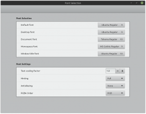
Aliased fonts for "mah old computer aesthetic". For best results, do this on old software and hardware and a CRT screen, but I digress.


Constraints that a collection of fonts must meet:
- Monospace
- size 9
- needs to look good when bolded, italicized, and bold italicized
- Prefer x height to be fairly large
- Proportional
- size 9
- size 10
- needs to look good when bolded, italicized, and bold italicized
assessment of fonts
- Ubuntu Regular
- Tahoma Regular
- MS Gothic Regular
- VGA Medium
- https://creativemarket.com/SelfBuildType/4026524-Standard-Pixel-Art-font
Oh noes
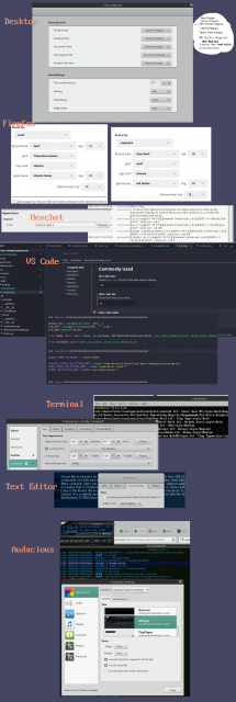
I changed some things more toward how I wanted it to look but I don't remember what exactly I did and I don't understand everything about how all the parts interact.
I think Firefox on Linux refers to fonts.conf located in ~/.config/fontconfig for its font-related settings and I suspect settings there override what you might specify in about:config. Reason is: I tried disabling anti-aliasing and got it disabled in webpages but not in the UI of the program itself. Then I closed and reopened it and the anti-aliasing was present in the UI (and ugly as fuck because of no font hinting). Then attempts to change the settings back in about:config failed. I fixed it by opening fonts.conf and putting settings: antialias false, hinting true, hintstyle hintfull, autohint false. With the hinting in place, it looks good again.
A bunch of configs I use:

Some things still look bad, like
- Steam. That's what happens when programs control their own fonts and font rendering and window management instead of delegating to the OS. ONLY MUSIC PLAYERS CAN DO THAT, AND ONLY BECAUSE THEY ARE GRANDFATHERED IN!!
- Another thing is that either I'm getting CSS wrong, or Stylish can't override fonts with CSS when I have disabled webpages overriding my default fonts.
- A third is that some programs in Linux Mint use some custom window decoration style that doesn't look as good as the main one. (the preferences window for the text editor is an example. it's this fat top bar look with hamburger buttons, think it's from GNOME but not sure)
- mattari doesn't look right when I disallow overriding fonts for websites even though Strange World looks right (Strange World even has correct line spacing)
At least Qt programs look alright. Qt is always so janky and second-class.
I should hunt down more Microsoft fonts and remove some useless fonts and generally organise my collection some more... I'm sure there are lots of cute fonts waiting for me to find them...
Further reading: https://wiki.archlinux.org/title/Font_configuration
Dark Themes
Most of my programs are in light mode, but for a few it just feels right to use a dark theme for them. Anything to do with code (text editors, IDEs, the terminal), music players, and drawing programs like GIMP and Krita. Perhaps what they have in common is that they are what you use when you are being creative.
Websites are another matter. Every website brings its own mood and should control its own theme. It's too bad that most websites assume that anti-aliasing is being used and don't pick font settings that look good without it, hence the need for disallowing them from overriding the defaults.
